

Peanuts - UX Case Study
Project Title: Peanuts - A budget-friendly management website.
Duration - 6 Months
Project Details:
This project is a part of the “Google UX Design Professional Certificate”. I had this opportunity to study with the Google UX design team themselves. The lectures and notes helped me a lot to understand the basics well. There were a lot of personal stories from the employees which were motivational and an eye opener to the bigger world. All my assignments were peer graded hence, I got the opportunity to interact with fellow students who also helped me by correcting the unnecessaries and smoothing out a clearer vision.
Vision:
Providing a website for easy budget calculations. People are actually just busy currently, be it work, studies, projects, traveling, or enjoying with friends. The free time they have is where they prefer to spend with family or friends. So, what's the stress by the end of the month? It's their monthly budget. The vision of this project is to help people who actually prefer to keep track of their budget on the go using cloud services by providing them with the option of managing the finances of their family members using an interactive and simple layout.
Kickoff:
When I started this project I had some initial key questions running in my mind, like:
Who is our user?
What are the goals of that user?
In which situation would someone use this website?
How large is the scope of Budget management websites?
After interviewing four participants to establish archetypes, later on, it became evident that the goals they wanted to accomplish all fell within the same categories; an easy and simple place to store, add and manage their finances.

Evaluating the activity
Usage of budget apps:
According to a survey conducted by Attest, the majority of under the 30s in the United Kingdom (UK) use some form of an app to help them budget. In terms of frequency, most individuals used a budget app anywhere from once a month (10 percent) to every day (14 percent). Only four percent of respondents said they used a budget app more than once a day.
Research
Competitive Analysis:
So, as the saying goes if you can’t beat the competition, join the competition. This was just user research and not a war so I had to venture out and see what the prominent budget management applications were already doing thus I ran a Competitive Analysis to understand whom am I going to face, what services do they offer, are users really satisfied with the current offerings? What are their frustrations on a daily basis? I evaluated several features deemed vital from user surveys to list my key findings and insights, and write user stories and problem statements with the help of pain point to follow up, thus, identifying which one’s peanuts could capitalize on to have a leg-up over other websites and application.
Considering the aftermath, I made a Competitor Audit Report and a competition set-up in a tabular form which includes the data related to different features offered such as Modern UI, Printing & exporting, Database Management etc, features to name a few. You can find the reports below:


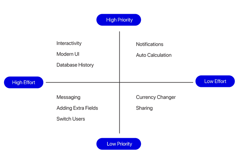
Prioritization Plotting:
Plotting a list of the possible features onto a graph helped narrow down what was absolutely crucial for delivering the MVP and would be built upon further down the road. A big draw of using this application is the user can save the data on the go, along with exporting and printing options whenever required. The application also allows 24x7 customer support in case the user is stuck with an issue.
I had to interview a few people to screen participants for testing my application. After the interview, I decided to make user personas and user stories, & note their pain points to understand and empathize with the user.
I chose 2 fictional stories which represented the user base to its closest for my application.
A mom and her son who were busy with their work and studies respectively along with managing their personal life, and responsibilities faced different difficulties in managing their daily budget.
I started by charting down the details after the interview to map and empathize with the users.
Empathy Mapping:
Empathy maps are easily understood charts that explain what UX designers have learned about a particular type of user.
The first Empathy Map belongs to Martha Johnson and the Second for Jayden Johnson. I designed them using a Slider Deck Gallery.
This empathy map breaks down all the points that will be needed to determine how my website can meet Martha's and Johnson's needs.


Pain Points:
UX design is all about the user. Designs are always for the user. To empathize with the users it was important to get into their heads and find their struggles. Being a problem solver was one of my top priorities.
So, after mapping empathy, the next step was to find the pain points for both Martha and Jayden.


User Persona:
Personas are fictional users whose goals and characteristics represent the needs of a larger group of users.
Personas were generally created from user research and by identifying common pain points, which are UX issues that frustrated and blocked both Jayden and Martha from getting what they need from a product.
One of the key findings from my user research was that users of varying skills (tech-savvy, Nerds, Luddites, etc) ages and occupations have different needs. 2 user personas were created for a family. Primarily a mother and her son who have different personal skills and job types. I revisited the user persona often in order to remind myself of the needs and frustrations of my users and to maintain a user-centric focus for the duration of the project.


User stories:
A user story is a fictional one-sentence story to inspire and inform design decisions.
Finally, I created user stories that I could use to understand the potential needs of users better, to help decide on the functional requirements for peanuts, and that I could refer back to remind myself of the needs and frustrations of my users, also to maintain a user-centric focus for the duration of the project.

Problem statement:
Problem statements provide a clear description of the user’s needs that should be addressed. To understand and identify constraints that prevented users from reaching their goals I designed problem statements for both Martha and Jayden.


Finally, I created a task analysis and user flow for each persona. This gave me a clear picture of the steps that the user would need to take to reach the final goal, and how to deliver this goal in the most effective manner possible.

The core features:
With a better idea of my user and their needs, I identified three core features that I wanted to focus on for the product.
Interactivity
Interactivity among different elements using the modern UI and colors would be helpful for people of all ages to adjust aesthetically as no one likes a boring layout filled just with numbers.
Automated Services
Since People don’t prefer spending more time on budget apps, Going digital is a way of saying “please do it for me.” Thus, to please the user's needs solution was an automatic saving feature using cloud services and also adding a calculator which calculates the sum after every increment or decrement.
Custom Fields
Generally, the websites had fixed fields to add data as per my competitor’s audit. Users didn’t have any other option to add. So, Giving them a place to add more fields as per their wish was the best solution I could think of. No limits to pages and fields would help the users to organize and adjust their incomes and expenses easily..
Information Architecture:
After noting the core features, to gain insight into the organization of information I conducted card sorting. It was helpful to understand how to display the pages, which order to follow and how these pages connect with each other hence the user gets a seamless experience with minimum roadblocks and frustrations.

Low-fi wireframes
Wireframe Phase 1:
To highlight the core features I kept the number of screens to a minimum. Ease, simplicity, and interactivity are the top 3 core features of my product. I started with P&P wireframes. I did make 5-7 different iterations to test and later on chose the best ones which worked well in combination and in conjunction with meeting the needs and feasibility of the user.

Next, I created mid-fidelity digital wireframes in Adobe XD, created a clickable prototype, and found a few people who were interested in trying and testing my working prototype of digital wireframes.

User testing:
After paper wireframes, I tested my digital wireframe where users were asked to perform and complete functional and situational tasks that would test the main features of my web app. They were also asked to give an overall final impression of their experience throughout the process,
Through usability testing, I was able to understand where my thoughts, ideas & designs took a back seat, faced a few designer biases, and struggled to meet user and research expectations.

To understand and bring the train back on track, I used sticky Notes. Thereon I grouped the similar issues together and found common themes to work on.

Design Changes:
After considering the problems reported in usability tests, and honestly, I also connected with a few of my design buddies who gave me their opinion, suggestions, and feedback, I had to make some important changes listed below:
Change 1:
On the main screen, I placed the item fields horizontally instead of vertical lists as it looks cleaner, and opens up more space for viewing, giving the user easy navigation through the page.
Change 2:
Instead of the expenses list opening on the same page, I shifted the list to a different page that can be used to check, update and add income and expenses which would also give a better understanding of debits and credits as they are color coordinated.
Change 3:
Looking back at the problem statement and pain-points Annual monthly reports were an important ask. Thus, I also added an analytics page that breakdowns all the income and expenses to give the user a clearer idea about the entire month’s transactions.
Change 4:
Definitely, what I missed earlier was a page for messages. So, I added that as well. And Lastly for now Exporting and Printing feature. Done.
I thought of redoing the P&P wireframes to get a better understanding of high-fidelity designs and prototypes.


After many tests and iterations, my final product aligned with all of the objectives I had set in place - it includes the three core features necessary for users while appearing visually appealing and simple to use.
