top of page

The Retro Room
Posters//
Typefaces//
Digital//
Art Direction//
My goal with this project was to explore the design styles of the 70s, 80s, and 90s and understand the differences between vintage and modern aesthetics.
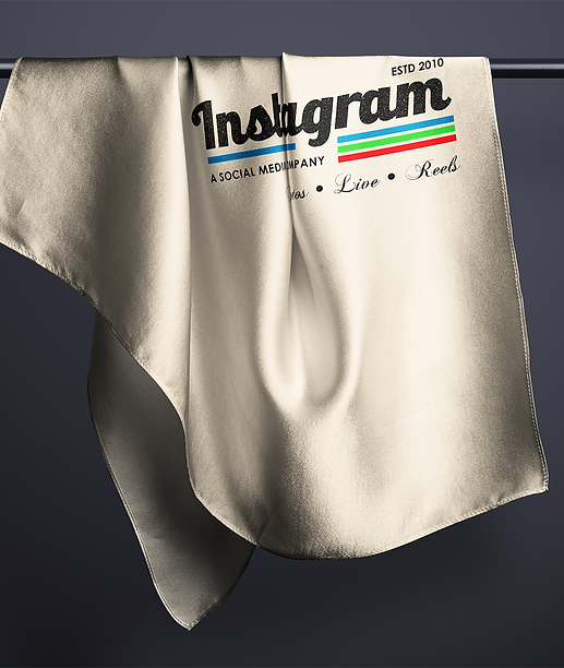
I created three vintage-style logos, a couple of posters & a few logos with a modern twist but a vintage theme. I plan to continue adding to my portfolio by practicing and learning from the origins of design.


What I learnt
In modern times, typography has significantly improved with the use of visual hierarchy, organized text, and varying weights.
In the past, front covers of magazines and editorials displayed a lot of textual information to provide a brief context of the contents.
Previous design forms utilized multiple pictures, shapes, and bold texts, which are not commonly seen in current designs. Pastel colors were often used, which gave importance to the objects, images, and text in the foreground.


Adding Modernity to Retro


bottom of page